By Wahome Ngatia
For centuries, the world has been looking at Africa through the wrong lens. Not because of opinion—but because of the map.
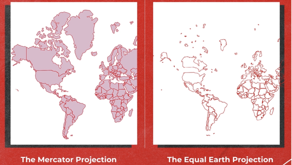
The Mercator map, drawn in the 1500s to help sailors cross oceans, stretches the northern world and squeezes the middle. It makes Greenland look like a giant, and Africa look… modest. The truth? Africa is so massive it could swallow the United States, China, India, and most of Europe—and still have room left.
Now, the African Union (AU) is saying, “Enough.” Backed by the #CorrectTheMap campaign, they want the world to ditch Mercator and use the Equal Earth projection, which shows the planet’s shapes and sizes more honestly.
“This is the longest-running misinformation campaign in history,” says Moky Makura, head of Africa No Filter, one of the campaign’s leaders. “When Africa is shown small, it feels small. That shapes how people see us.”
Speak Up Africa, the other driving force, is fighting to put the Equal Earth map into classrooms. “Kids deserve to see their continent for what it is—huge, diverse, powerful,” says co-founder Fara Ndiaye.
For AU deputy chair Selma Malika Haddadi, this isn’t just about geography—it’s about identity, pride, and Africa’s place in the world.
The ripple is already spreading. Google, the World Bank, and others are moving away from Mercator. Now the AU wants the United Nations and every school to follow.
Because when Africa is drawn to scale, the world can finally see it for what it has always been—not small, not secondary, but vast, vital, and impossible to ignore.